Fitness Web App
Role
UI Designer
Case Study
Fitness
Categories
Mobile Web App
Tools
Figma, Protopie, Zoom
Problem Context
Live-stream workouts is an increasingly popular way for woman to achieve physical, emotional and mental well-being. While the are plenty of sources where online gyms are proving different types of exercise routines, often fitness consumers are struggling to find the place that suits their wishes, especially if they want to try something new.
Project Goals
Provide a personalized experience tailored to individual user needs.
Create a mobile web app that is user-friendly and accessible to individuals of varying fitness levels.
Introduce popular training programs that can also be adapted to an online application.
Develop a dashboard that allows users to view an overview of their fitness goals and provides the option to add training programs to their calendar.
The Solution
The response is to create a mobile web app that helps the end-user achieve their personal fitness goals whenever they have available time, but first, we have to get to know the user.
01- USER PERSONA
User Needs and Goals
Our target audience is mainly women whose hectic lifestyle does not allow having enough time to attend a fitness club. They require a tool that is easy to use where they can find a wide variety of workouts and levels of difficulty ready to use at any time of the day to help them achieve their goals. Since the site is directed at a younger demographic, my aim is a modern, clean look and feel.
02- USER FLOWS & USER STORY
Once I knew the needs and goals of the final user, I made some User Flows with the purpose of creating screens where we can see the path that a user like Rebecca needs to transit to complete a task (👇below an example).
This point in the process also allowed me to get an overview of the complete flow that Fitted will have at the end of the building process.
03- WIREFRAMING
Feature Scope and Happy Path
After creating user flows, I spent some time coming up with possible solutions that I illustrate as a way of low-fidelity wireframes; after adjusting some final details, I converted them into mid-fidelity wireframes.
The image below displays; the path the user has to take to complete a task.
Low-fidelity Wireframes
Mid-fidelity Wireframes
I decided to keep the design simple and easy to use, keeping in mind the goals and needs of the users. I change some elements and employ others that are familiar.
Before giving life to the high-fidelity wireframes, it is necessary to choose the elements that will provide the visual image that will make Fitted visually appealing therefore, the Moodboard is a good starting point.
04- Mood Board
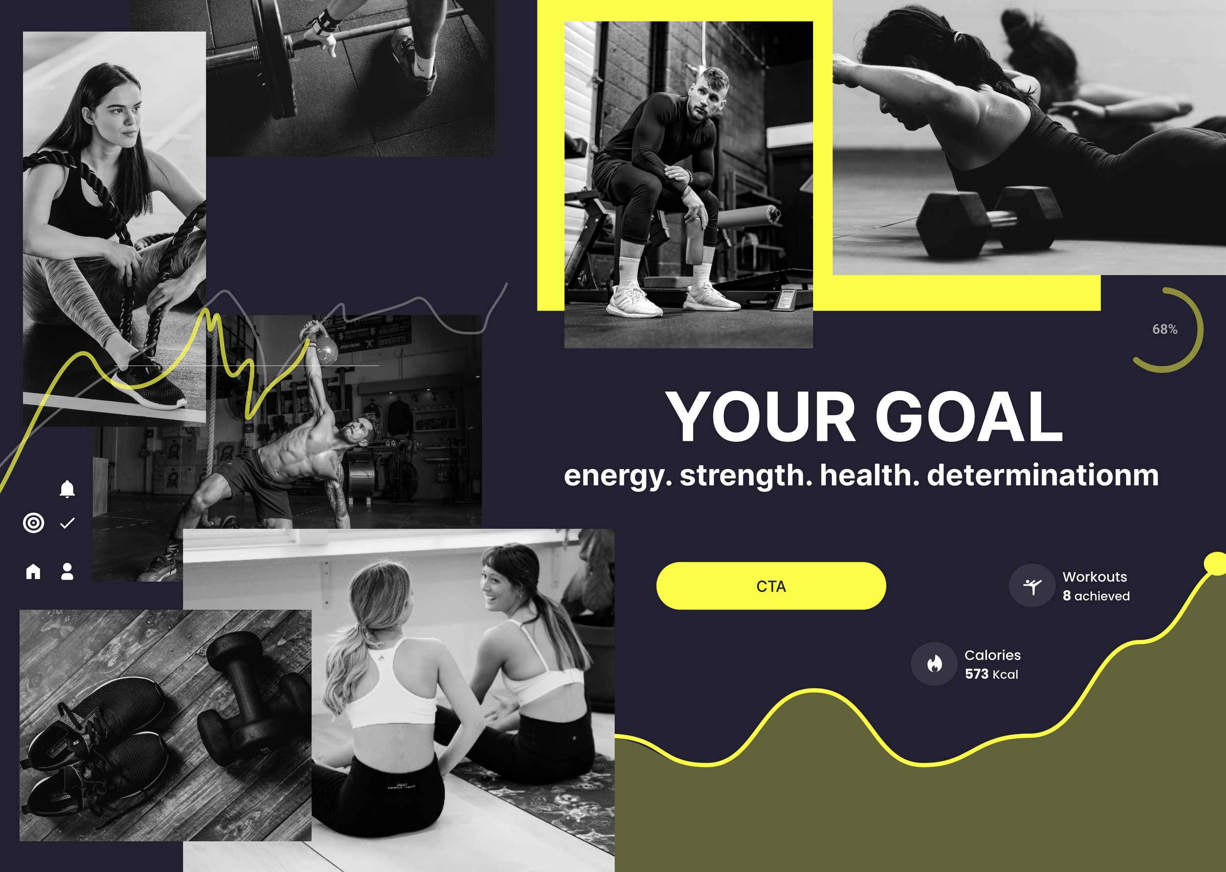
I created three different mood boards based on three keywords that best represent the target user and considered elements such as typography, color, pictures, objects, and shapes. Analyzing the competitor`s brand image also helped me select colors and photos that will stand out from the rest. The main goal is to determine where the final visual design would be headed. As a final step, I selected the mood board in which the image represents the audience best.
05- STYLE GUIDE
After deciding on the general direction of the visual design, I took the time to come up with UI elements which I then compiled into a style guide. This guide is crucial to keep Fitted consistent throughout the screens, whether that be related to color, typography, imagery, or components. Below 👇🏻👇🏻👇🏻 example.
Typography
UI Elements
Icons
Heading and Text
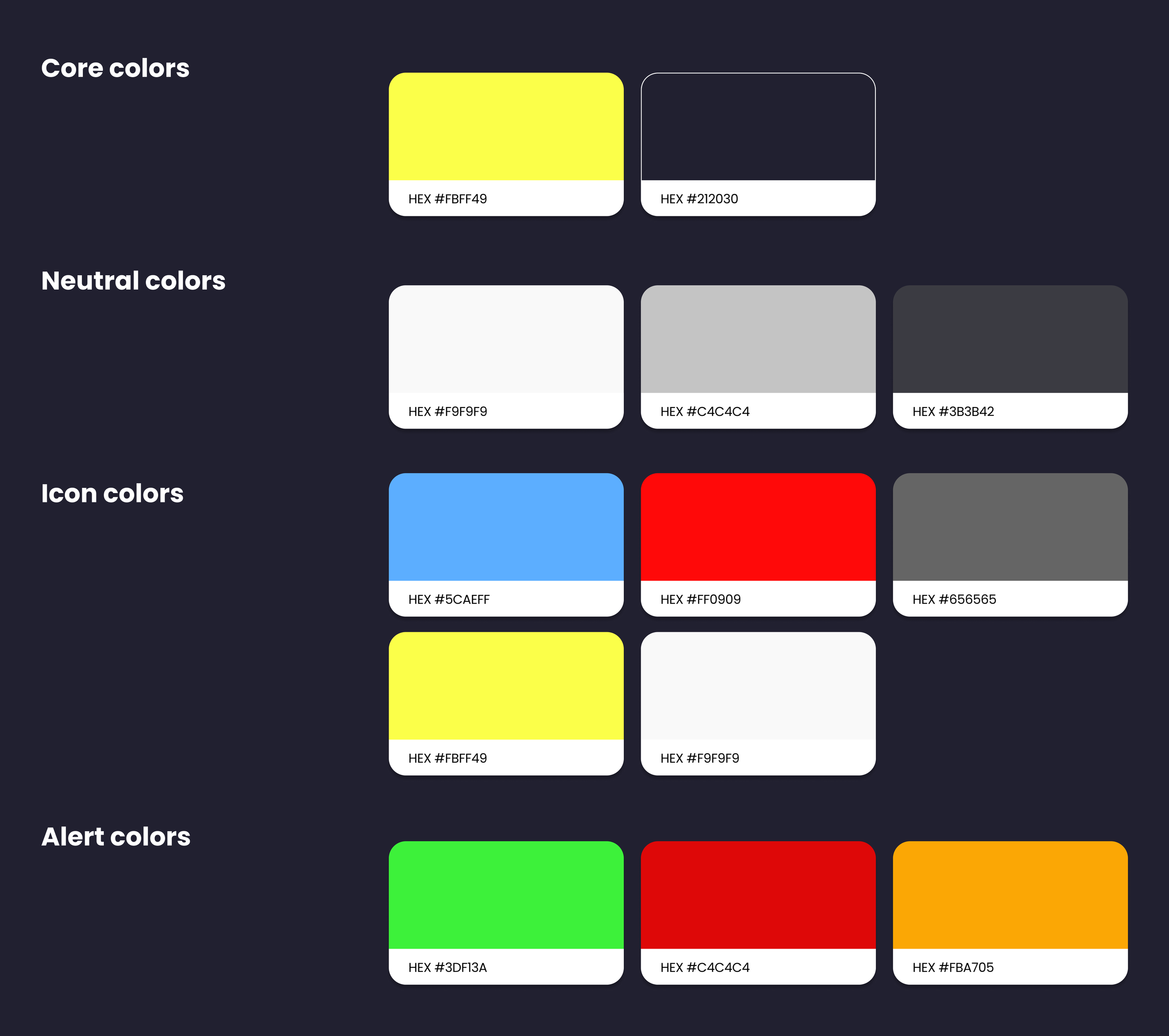
Colors
06- FINAL DESIGNS
Once I selected the mood board and created a style guide, I proceeded to bring to life the mid-fidelity as a form of Final Designs. I chose vibrant colors and mixed them with white to create an energetic but at the same time clean image; institutional pictures denote motivation and vitality however they are set in black and white to convey simplicity.
This step, for me, is relevant since it helps to construct an identification and relationship between the final user and Fitted.
Here some examples of what I created👇🏻👇🏻👇🏻
Splash screen for a pleasing introduccion
With the objective of creating an aesthetically pleasing web app, I decided to design a captivating splash screen. This not only captures user interest but also persuades them to take the next step in engagement as it leads to easy access to account creation ensuring a seamless transition, and guiding users directly toward conversions.
Splash screen
Steps before starting
Our mission is to help users reach their fitness goals, which is why we ask for essential information like height and BMI to tailor our support to their unique needs.
Home page
Adding workouts in the calendar
User`s profile
Filter
Seeking more personalized options aligned with your goals? It's a simple process. When users access the page featuring the courses, just click on the "Filters" button. A pop-up window will appear, allowing you to activate various filters such as type, difficulty, and program duration. This addresses the need for a mobile application tailored to users' preferences.
Users can rotate their mobile phones to expand the video, allowing them to capture every detail during the training without any loss.
Filters ease-in window
Menu
Choosing date of birth
Video Training
Creating an account
Training Courses screen
Workout Program
The training program is made to enhance the overall condition, constitution, and nature of the body, focusing on aspects like flexibility, strength, endurance, balance, and agility, among others. Considering the diverse needs of users, a variety of programs have been developed, allowing users to select the one that aligns best with their specific requirements.
When accessing a program, users will find relevant information at the beginning of the screen, like a description and benefits. This information serves as a guide to help users explore various workout options presented in the form of videos. Each video is accompanied by essential details such as title, level, and duration. Additionally, users have the option to easily integrate selected workouts into their calendars, ensuring that Fitted becomes an integral part of their daily activities.
Goal setting
Activity screen
Chosing a course from the Home Page
BMI calculator
Home Page
In order to meet the needs and preferences of the users, I have designed a homepage that offers essential information. This enables users to gain an overview and have better control over their activities, available courses, and ready-to-complete workouts tailored to individual objectives. The home page provides easy access to the user's profile, allowing them to modify their goals as needed.
07- CASE STUDY CONCLUSION
Putting it all together
Fitness apps have had exponential growth in recent years therefore, creating a product that could differentiate itself from the rest and keeping the focus on the user was the biggest challenge. I invested time in analyzing the competition and discovered that most of them offer similar features and a similar brand image; for this reason, I decided to concentrate on creating a clean, and attractive image so that, at the same time, the end-users could feel identified with the brand image, which intention is to inspire, motivate and encourage to achieve their goal without leaving aside the most crucial objective; that the user can complete a task as quickly and easily as possible.
Thank you for reading through this project! 😀
Special thanks to my photos suppliers:
pexels.com
freepik.com
pngmart.com


