
Just by Emma Case Study
As a UX Designer, I worked in an Agile environment with a team made of a UI Designer and two developers. I worked closely with the client and the other stakeholders to transform the current e-commerce web app into one that aligns better with commercial standards and applies the best usability practices.
01- THE PROBLEM
Just by Emma is a natural skincare startup based in the UK; their products are handmade and use carefully selected ingredients from local suppliers with clear ethical policies. Being a niche product, the range of products and components is competitive and is widely accepted among consumers however, the online store is not the right one with many pain points that is falling to convert visitors into sales, unfortunately, many customers are contacting through email to purchase instead of using the e-commerce webpage. If the company wants to continue to grow and remain relevant, using usability best practices is part of the solution.
02- SOLUTION TO THE PROBLEM
As a first step I decided to conducted a User Test and made a Comparison Analysis to see what the competition is doing and from the users` viewpoint to better understand the problem.
What I learned
1. Users were not trusting Just By Emma checkout process.
2. Usability flow is deficient having several pain points.
3. Webpage structure is not adequate.
Research Methods
A) Competitive Analysis
I made a Competitive Analysis to acquire valuable insights to develop a strategy to enhance the user experience and business value. For this analysis, I choose four relevant web apps:
Direct competitors. The Body Shop and Bath and Body Works.
Indirect Competitors. American Eagle and Gap.
Aiming to get the following information:
A comprehensive picture of the market.
Competitors' best practices.
Usability.
Cart flow.
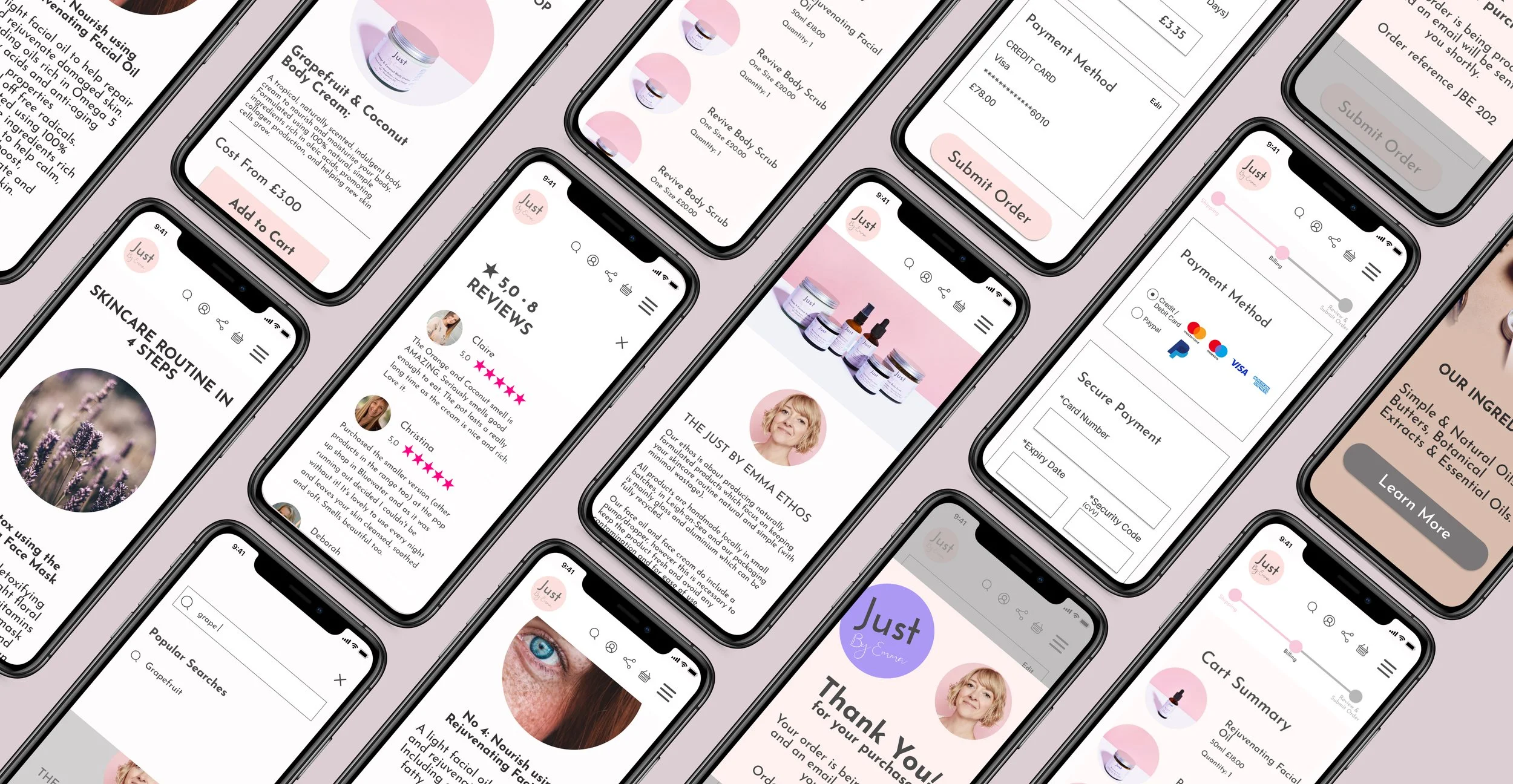
03- THE VISION
To build trust with the client and establish a strategic direction, I work closely and in a collaborative way with the rest of the team to reach the client's business objectives and meet the client's needs. The goal was to reimagine e-commerce and a checkout experience that was simple, relevant, and trustworthy.
I took a design approach to find the best solution to the users' problems. Together with the UI Designer we create design concepts for core screens and develop solutions to our key customer pain points. Ideas included a more understandable and easier add-to-cart and checkout process, letting users leave a review from their purchase and a better-organized store.


